
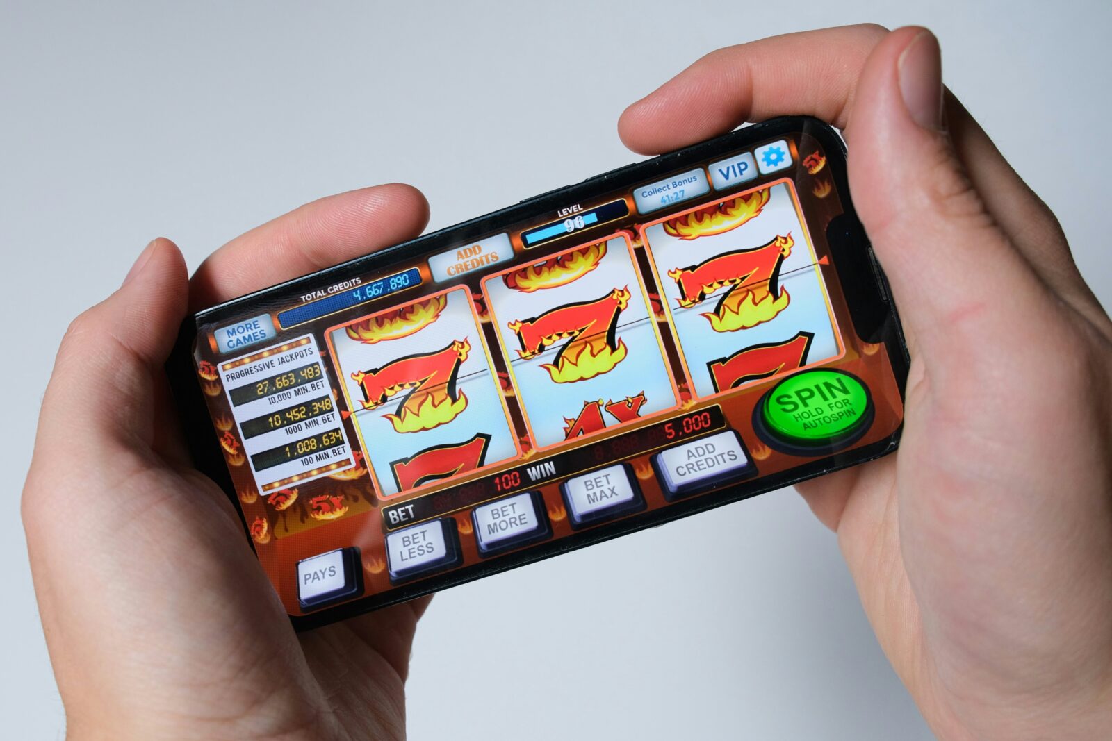

There are casino apps with enormous game libraries that somehow still feel awkward after a few minutes. The graphics might look good and everything technically works, but getting around takes more effort than it should. You open the menu and it covers most of the game, swipe through several rows looking for something you played yesterday, then discover that the back button has taken you somewhere you did not expect.
Get those details right and the whole app feels easier to settle into. The game is simple to find, the controls sit where your hand naturally expects them, and the account area is never buried three menus deep. Most people will never think about the tech making that happen, and they do not need to.
What they notice is that everything feels straightforward, familiar and comfortable from the moment they start using it.
Mobile Design That Feels Natural
A phone is not a small laptop, even if plenty of apps still behave as though it is. People hold it differently, move around while using it, switch between apps and often come back after being interrupted by a message or call. All of that changes the way a casino interface needs to work.
With the betway app, for instance, the casino games lobby, account area and main gameplay controls need to remain easy to reach without making the screen feel packed. When that balance is right, the app simply feels natural to use rather than noticeably “mobile.”
The Lobby Should Not Make You Search Twice
A large casino library sounds good until you have to find one particular game inside it. On mobile, endless rows of thumbnails become tiring very quickly, especially when the user has already played the game before. Search, recent games and sensible categories therefore matter more than decorative banners that take up the first half of the screen.
The best casino lobbies remember that people often come back for something familiar rather than wanting to browse from the beginning every time. This is where good UX starts to feel almost invisible. Nobody opens a casino app hoping to admire the navigation system. They simply want it to get them where they are going without slowing them down.
Lifestyle Has Changed What “Convenient” Means
Mobile casino apps like betway are part of a much wider shift in digital lifestyle. People now expect entertainment to follow them between devices and fit around whatever else they are doing. Music, video, sports, messaging and gaming all live on the same phone, which means a casino app is competing for attention with everything else on that screen.
That has raised expectations. Users are less tolerant of clumsy menus, long waits and screens that feel like they belong to an older generation of mobile design. The casino industry has had to move in the same direction.
Smooth Design Is a Collection of Small Wins
What makes a casino app easy to use is usually not one big feature, but all the little things you barely notice when they work properly. When those basics are right, the app just feels comfortable to use. When they are not, you start noticing every extra tap.
That is the interesting part of mobile casino tech. The most successful work often disappears into the background. The player sees the casino games, the entertainment and the gameplay, while the interface quietly handles everything around them.
When that happens, the app does not feel clever or complicated. It simply feels easy to use, which is usually a much harder thing to design.